Improving UX & Accessibility with Inclusive Design
Services
Client
TACT
Industry
Higher Education
Year
2024
Achieving accessibility for diverse audiences requires proactively understanding their needs to deliver person-centric solutions.
Overview
Reimagining TACT’s brand was a mission-driven effort to better represent their commitment to empowering neurodivergent individuals through skilled trades education. Manhattan Strategies crafted a refreshed identity with a new logo and a simplified, accessible website that speaks directly to parents, students and potential employers. By aligning the brand with TACT’s values, our team helped them connect more effectively with their community and support those they serve in a meaningful way.
Opportunity
TACT's previous branding and website design didn’t fully support their outreach efforts. The existing logo and visual identity felt outdated, and the website’s complex layout made it challenging for key audiences—parents, employers and students—to find relevant information quickly. There was a need for clearer navigation, more direct communication and improved accessibility features to better serve all users and effectively convey TACT’s purpose.
“Partnering with the Manhattan Strategies team has been a transformative experience,” shares the TACT team lead.
“Their passion and dedication to crafting a site that embodies our mission—empowering individuals on the Autism spectrum through skilled trades—has been nothing short of inspiring. Manhattan Strategies Team understood the heart of our work and committed themselves fully to amplifying our impact. Knowing that their work would help us reach and inspire more students, families, and companies has been deeply moving and a true testament to their expertise and compassion.”
With a shared vision of accessibility and empowerment in mind, our team created a clean, modern brand identity and user-friendly website.

Removing visual clutter, establishing clear navigation and crafting tailored calls-to-action for each audience segment were key elements of the rebrand. The result is a platform where all users can comfortably engage with content.
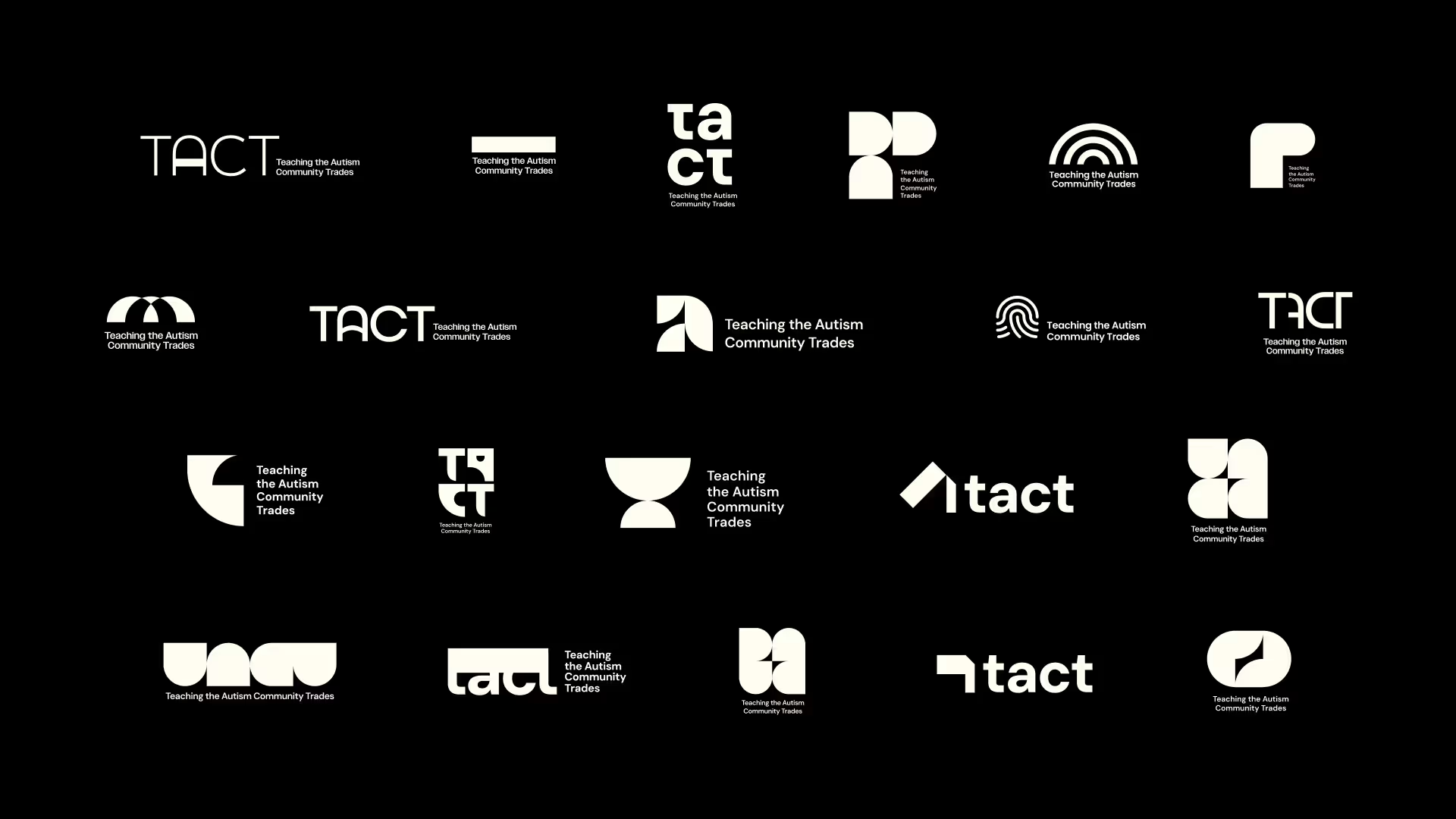
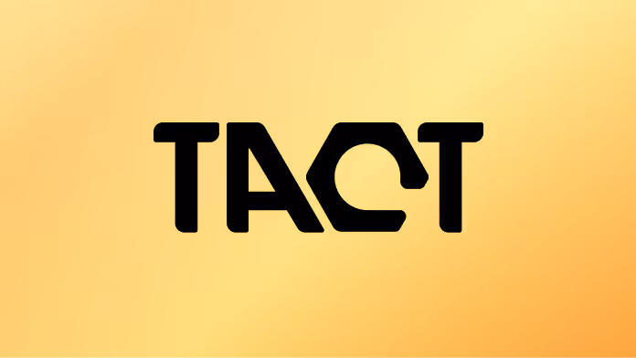
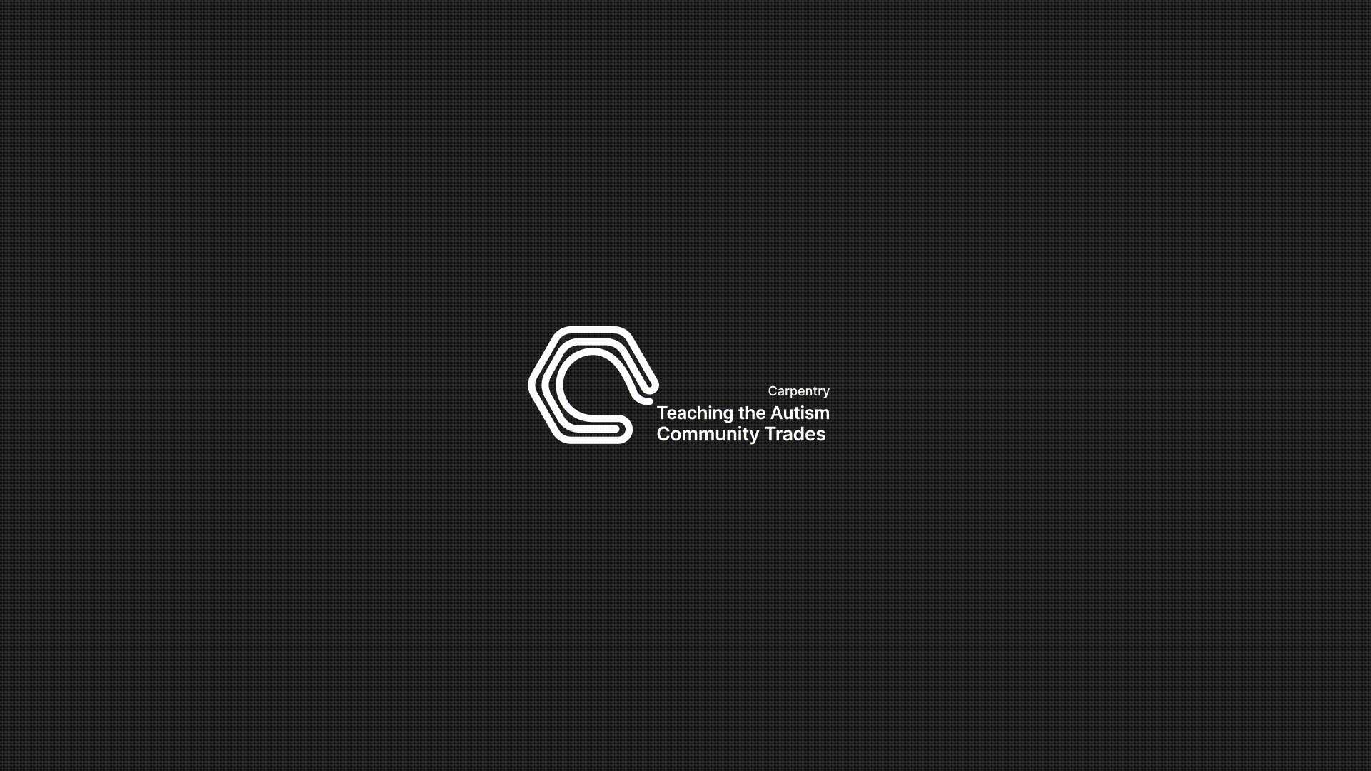
Our creative journey began with the goal of developing logos that reflect TACT’s mission and vision, showcases its adaptability and commitment to diverse trade programs.
After exploring various design directions, our team discovered the powerful potential of the letter "C" in TACT. This versatile element became the cornerstone of a dynamic, customizable logo system.
.avif)
The "C" symbolizes more than just a letter—it embodies the flexibility and innovation at the heart of TACT. It seamlessly adapts to represent the unique identity of each program while staying true to the organization’s core values. This cohesive visual anchor now serves as a unified emblem of the opportunities TACT offers, resonating with their dedication to empowering students across all trades.
Results
The rebrand delivered exceptional results, enhancing brand perception and driving significant gains across key performance indicators
Website Traffic
User Engagement
Team
Serena Tolar
,
Ruby Fair
,
Sophia Velasquez
,
Jackie Nguyen
,